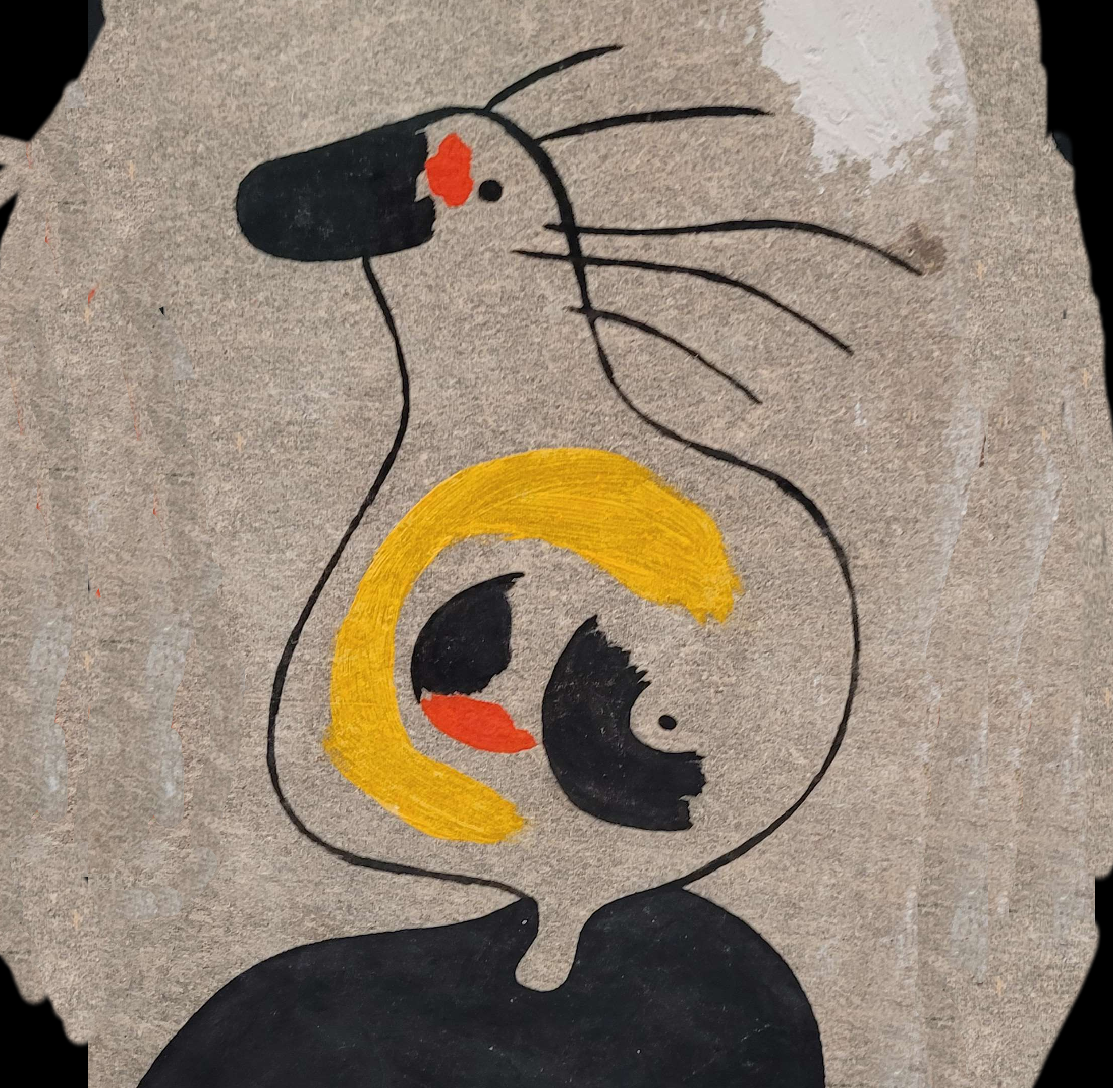

That’s right! I’d seen images like these online:


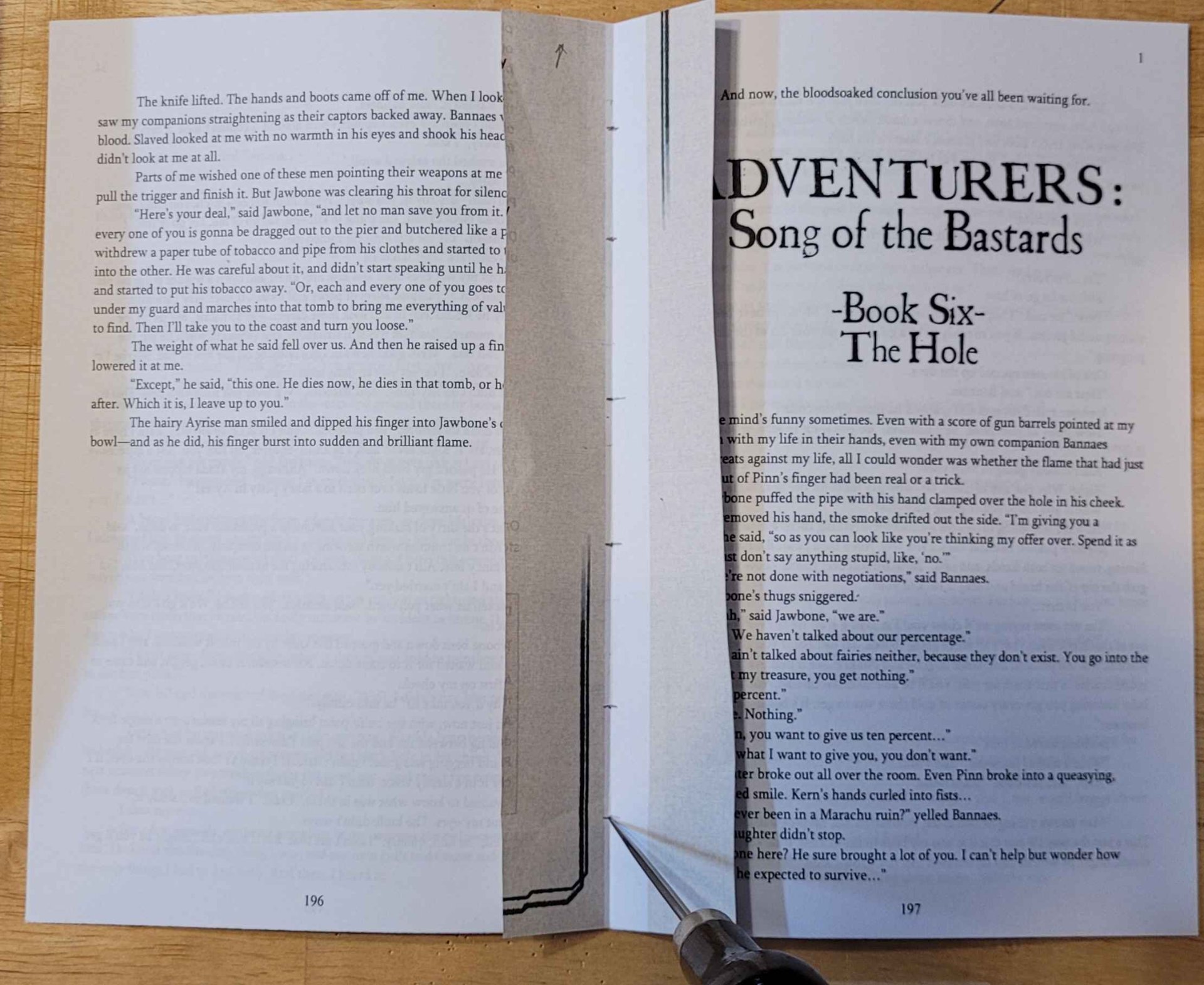
So I knew it could be done and that for some reason the fabric turned lighter where it was zapped, but I didn’t know why, or if that would happen when I tried it. I thought it might darken like paper and wood do when etched, or that it might burn all the way through, or just not look very good. My backup plan was to use the etching as a guide and to paint the letters on with gold paint (I’ve got a pretty steady hand with a paintbrush from painting warhammer in my youth so it felt like okay odds of success) but it turned out much like the other images I saw!
I’m attaching a close up photo to hopefully give you a better idea of how it looks:

I think you can see that the cloth is a little diminished, and the etched section is maybe a thousandth of an inch (or two) lower (though I don’t think the white color is coming from the glue on the back or anything because it’s so consistent). I’m not sure why it reacted like this.
 Looking at this test I don’t think I can feel a difference in depth with fingertips until I get to 30%.

I’m definitely a beginner too, especially with using actual cloth - I think I just got lucky with which fabric I happened to have on hand.
This simple beginning definitely got us thinking about more elaborate stuff to try in the future. Part of why I did a basic cloth hardcover was that the author never made any cover art for it, and partly that I just thought it would be a good fit for the feel of the story. But for some of our own I think we can do some really cool versions of their cover art in this format. Part of that would be inverting the colors and dialing in the contrast for clarity.
I’ve seen some really cool looking illustrations etched on online demonstrating the potential: