The Picard Maneuver
Also The_Picard_Maneuver@startrek.website
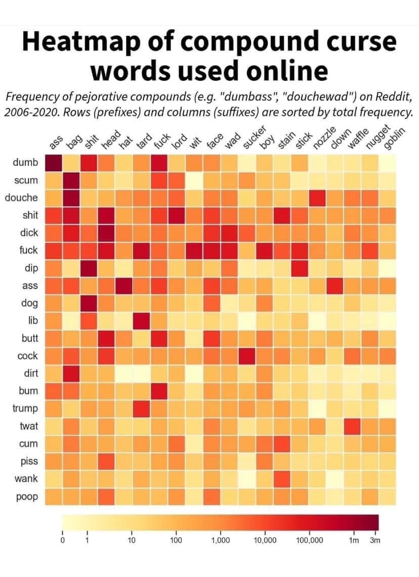
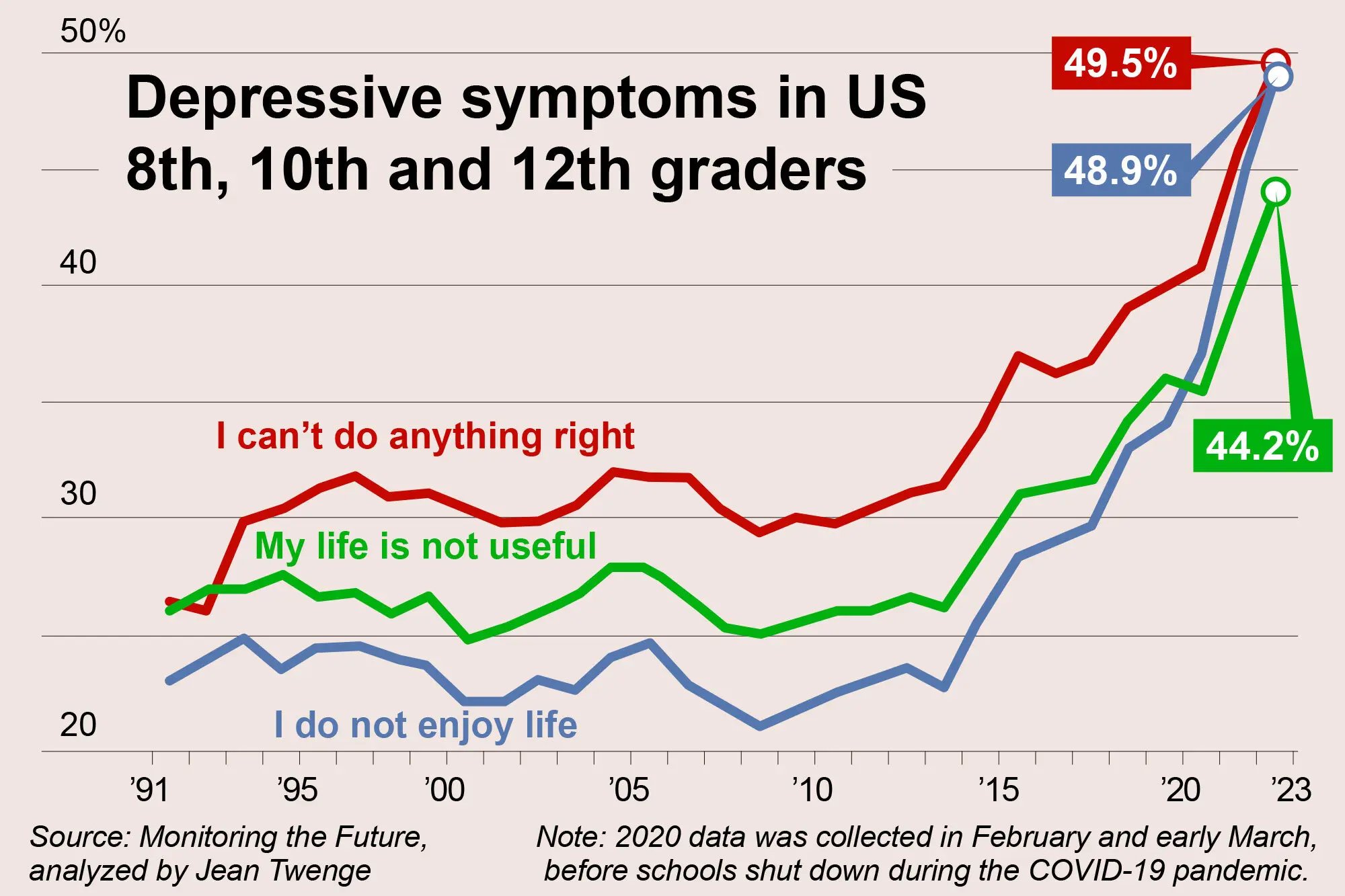
- 41 Posts
- 55 Comments
The Picard Maneuver@lemmy.worldOPto
Map Enthusiasts@sopuli.xyz•Grizzly bear historical and current ranges
2·7 months agoGood question. I assume that all of current falls under historic, but that could not be the case.
The Picard Maneuver@lemmy.worldOPto
Map Enthusiasts@sopuli.xyz•These highlighted parts make up 50% of the world's GDP
21·7 months agoOut of curiosity, I just looked up Alabama’s GDP, and it’s similar to the country of Portugal.
The Picard Maneuver@lemmy.worldOPto
Map Enthusiasts@sopuli.xyz•These highlighted parts make up 50% of the world's GDP
27·7 months agoI assume they intentionally left out some to round out the numbers a bit and hit 50% in a more interesting way without over half of it being the US.
The Picard Maneuver@lemmy.worldOPto
Map Enthusiasts@sopuli.xyz•Sunshine duration in hours per year
82·8 months agoI can’t seem to find the original source, but based on search results, I’m seeing that this map has been circulating in similar circles to this and solar power communities since at least 2016.
The Picard Maneuver@lemmy.worldto
You Should Know@lemmy.world•YSK that fracking is not safe. Residents living near fracking sites are significantly more likely to get cancer
9·8 months agoGood luck finding land that is not near fracking sites. It’s been done basically everywhere, right?
The Picard Maneuver@lemmy.worldOPtoData is Beautiful@lemmy.world•Percent of pixels, across all photos.English
6·9 months agoI had to look it up because I had the same question, but the data came from photos of stuff from 1800.
The Picard Maneuver@lemmy.worldOPto
Map Enthusiasts@sopuli.xyz•Where to live if you want to experience maximum diversity (and are a fish)
14·9 months agoI mean, if they can’t have the decency to be contiguous.
The Picard Maneuver@lemmy.worldOPto
Map Enthusiasts@sopuli.xyz•Where to live if you want to experience maximum diversity (and are a fish)
3·9 months agoProbably just no more than 2 species in a given area, but not necessarily the same 2 in every area.
Plus sub-species, I assume.
The Picard Maneuver@lemmy.worldOPto
Map Enthusiasts@sopuli.xyz•Where to live if you want to experience maximum diversity (and are a fish)
14·9 months agoThere are a bunch of other cool maps too:
The Picard Maneuver@lemmy.worldOPtoData is Beautiful@lemmy.world•Age Distribution of Hospital Visits Due to Punching WallsEnglish
26·10 months agoThat’s a good round number to trigger a crisis that you’re getting old. Better start punching things to prove them all wrong.
The Picard Maneuver@lemmy.worldOPto
Map Enthusiasts@sopuli.xyz•Percent age 25+ with Bachelor's degree or higher
10·1 year agoBecause otherwise the data would be artificially lower in areas with more children.
For example, imagine a suburb in Utah filled with college educated software engineers with big Mormon families. If you count the kids, it might look like people there don’t have degrees.
The Picard Maneuver@lemmy.worldOPto
Map Enthusiasts@sopuli.xyz•"Hot spot" map of prevalence of autism spectrum disorder by county
6·1 year agoThere is a researchgate link in the post body that has more info and a link to the publication. I haven’t skimmed through it myself, but I thought I’d link for anyone who’s curious.
The Picard Maneuver@lemmy.worldOPto
Map Enthusiasts@sopuli.xyz•"Hot spot" map of prevalence of autism spectrum disorder by county
341·1 year agoI don’t know, a lot of the red is over pretty rural areas in the south and parts of the southwest, and the majority of the most rural parts of the country are “not significant”.
Also that big blue part in the middle covers some very large cities.
The Picard Maneuver@lemmy.worldOPto
Map Enthusiasts@sopuli.xyz•Suicide Rates by County (USA)
9·1 year agoThe darker color in tornado alley is green for “no data”, which is odd, but I assume it’s similar to the darker orange and red around it.
The Picard Maneuver@lemmy.worldOPto
Map Enthusiasts@sopuli.xyz•Suicide Rates by County (USA)
39·1 year agoYeah =(
The map tracks with high American Indian and White populations.

The Picard Maneuver@lemmy.worldOPtoData is Beautiful@lemmy.world•Homicide Rate in Europe (by country) and the USA (by state) in 2020English
16·1 year agoIt looks like their source was the Eurostat Data Browser. Maybe these are just the countries it has data for?


Yellowstone National Park