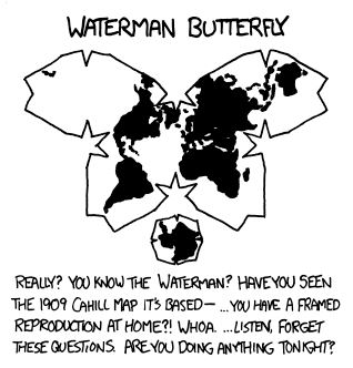
something to do with liquid nitrogen? /s
- 0 Posts
- 4 Comments
I wish whatever jackaſs that decided that the long ſ needed a ſtupid nub at exactly the ſame poſition as the croſsbar of the letter f in Roman typefaces a very unpleaſant afterlife. As if OCRing hiſtorical documents didn’t have enough problems already.

 8·2 years ago
The color schemes are terrible, especially for the top two maps. The upper and lower ends of the range (dark red and dark green) are just about the worst possible choice for colorblind folks (1 person in 20!). Even ignoring that, the lightest colors are midpoints in a sequential dataset, giving the false impression of a center point from which the data diverge. This doesn’t make sense for total population, the range for which is open only at one end (minimum of zero). You could make the argument about diverging from some measure of center, but that is not indicated anywhere. A diverging color scheme would be appropriate for the third map (change in population diverges up or down from 0, or could diverge around the global change), but there again the lightest color is arbitrarily located halfway up the range.
Here are some good examples for sequential and diverging color schemes: https://personal.sron.nl/~pault/#fig:scheme_sunset

raises hand since when does a spectrum not imply a total order?