
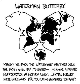
Africa is huge- many people underestimate it, although in this case it is a bit too large compared to India in the middle. Also the colorscale makes Sahara and other low desert areas too green - the habitable part is not so great.


Africa is huge- many people underestimate it, although in this case it is a bit too large compared to India in the middle. Also the colorscale makes Sahara and other low desert areas too green - the habitable part is not so great.
So, what do we do with the greenest areas? Cover them with splodges of grey, of course…


It’s about future oil and gas expansion (FOGE), what matters to the atmosphere is the total - identifying potential threat. Effectively multiplying FOGE by area (as shown) doesn’t make sense, but neither does FOGE per capita (as most is exported, not consumed locally). I’d suggest just a sized blob for each country - then can show some other dimension with the color.


That’s great progress, thanks for all the work!
Glad to see enhanced federation with rest of fediverse - a small detail : the link for ‘Automatically includes a hashtag with new posts’ should point to pull #4533 (not #4398 ) - should help discoverability from mastodon, especially if community tags become customisable.


Seems you have a few extra lines compared to openrailwaymap, are those all operational?
Pity so few cross-border connections, maybe we need an interactive map of the future network.


Nice map of fascinating region, especially by showing population density so we are not over-weighting mountains and steppe. However, I could imagine that most people and families in that region are multi-lingual and of mixed ethnicity, so mono-colours may be misleading and accentuate divisions. Cities are often different from villages around. Modern group identities may relate more to preferences for a type of governance, than to old ethnic history. Times change. How would this map look like now, and for example, in 1800?
Any map like this greatly overemphasises high latitude countries with a large surface area. For example, the population of Russia is now less than that of Bangladesh, which is hardly visible. It would be better to either show a distorted map with area proportional to population, or use population density for the colourscale, or use spots (to show where people really live, not in deserts or tundra). At minimum, choose an equal area-projection.


Could you show a map of changes over time ?
Odd that Estacio de França is now the terminus only of lines from the opposite direction - but it makes sense to run all across the centre.