
It’s been trending this way for years, but seeing it graphed out like this is shocking.
What do you think are the effects of this drastic change?
It’s been trending this way for years, but seeing it graphed out like this is shocking.
What do you think are the effects of this drastic change?
It could be that. I’m noticing now that the study I linked has a note about a sampling error they made:
So another possibility is that the data used for the graph is wrong because of a big correlation between sexual orientation and preference for online dating and it was made before this was corrected.
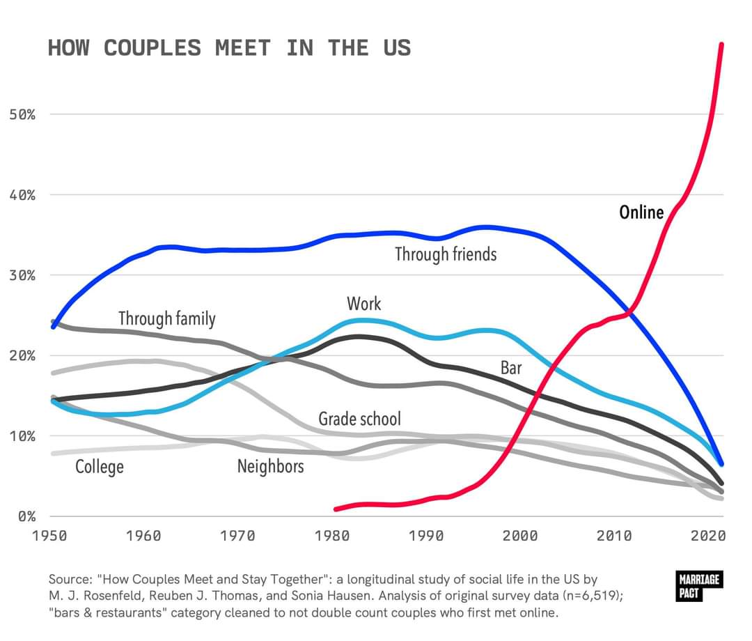
I don’t think the figures are intuitively implausible, mostly I’m just bothered by the apparent lack of any way to confirm the authenticity of the graph and its relationship to the source material, or get an authoritative answer to the question of how prevalent online dating is.
One reason to doubt them though, the other article I linked says that as of 2022
Which is the demographic that uses them the most. So it doesn’t make sense that more people would have met their current partner through a dating app than have ever used one.
Do you have a source for this, or is it just speculation?
The pewresearch link in my other comment gives a breakdown of percent having ever used a dating app by age cohort
Yes, but that’s a bigger denominator, and includes single people, and even those who have never been on a date. The headline question is what percent of couples met through different methods, not what percent of individuals, including those who are not currently in a couple.
It could be that a higher percent of couples met online than the percent of people who have ever used online dating. If you have a data set where online dating is literally the only way to meet people, but only half of the people are trying that method, you’d have the situation where 100% of couples met online but only 50% of people have ever tried online dating (this hypothetical is purely to demonstrate the math, not claiming that this is in any way a reflection or the actual data).
It’s entirely possible (and I’d argue is likely) that the 53% who have used dating services are more likely to be in couples than the 47% who haven’t. And so that larger subset of the 47% would therefore be excluded in the “percent of couples” data.
The 2019 paper I’ve linked is authored by the maintainers of the linked data set, and contains a very similar graph with an earlier cutoff (2017 data). I’m sure those authors know their data set. It’s just most of their papers using this data is paywalled, and the data is mainly used for other types of analyses.
If I have time I might be able to download the data set from a computer and just map it either naively or by applying the correct weights.
The graph in that linked paper is convincing to me. I wonder about the discrepancy in the line for Met in Bar or Restaurant though, the 2010 upward trend in that is totally absent in the OP image.
The caption for OP’s image says that stat was “cleaned up” to adjust for people meeting online. That could mean that some survey respondents met online and decided to meet in person in a bar or restaurant, and answered yes to both questions, and that those couples should be counted as “online” only.
Or it could mean they were actively swiping while at a bar or restaurant and looked up to see matches they’ve been recommended.
The last part doesn’t mean that. It’s 53% of the whole population under 30. Could be a higher percentage of the ones having a partner/married. Since the total is smaller if you just take the ones having a partner. Removing the ones still single/didn’t meet anyone.
Right, I get that it doesn’t strictly rule it out directly, but it’s a surprising discrepancy. That 53% is just for under 30s too:
while the purported figure for people having met their partner through an app is for all demographics. The number of people who are partnered vs single is 70%. If 60% of those met via dating apps, that’s 42% of the total. Which seems probably still more than the number of people who have ever tried them, and that would only check out with the absurdly generous assumption that those apps have a near perfect success rate and almost no one who uses them goes back to other methods.
You’re still not slicing thin enough.
If 60% of the couples who got together in 2022 met on dating apps, and people who got together in 2022 constitute 5% of all couples, that’s still possible (and probable), then those couples will still only be 3% of the total. Pretty easy to add up to 11% that way when you start including all the 10-year-old relationships, the 20-year-old relationships, etc.
If it were flat at 60% for all years then no, it wouldn’t add up.
But if you look at the area under the curve, it’s still pretty small comparatively speaking because it’s such a recent phenomenon. (And not every year would actually count equally for the whole data set, but it’s displayed in this chart as every year adding up to 100% for its own year.)
Ah, right