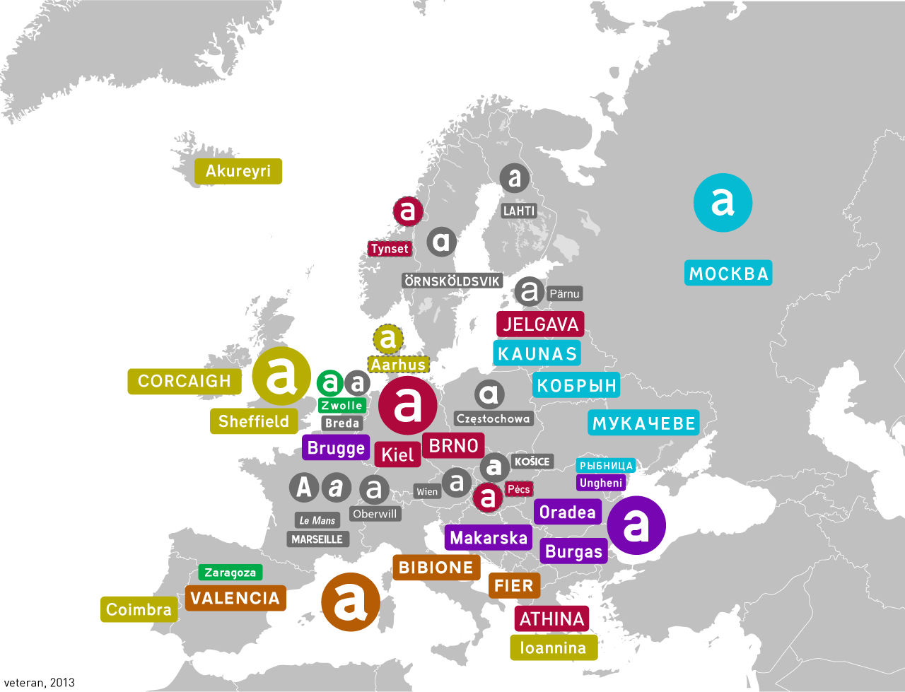
SubArcticTundra@lemmy.ml to Map Enthusiasts@sopuli.xyz · 2 years agoHighway fonts in different countrieslemmy.mlimagemessage-square28linkfedilinkarrow-up1120arrow-down16
arrow-up1114arrow-down1imageHighway fonts in different countrieslemmy.mlSubArcticTundra@lemmy.ml to Map Enthusiasts@sopuli.xyz · 2 years agomessage-square28linkfedilink
minus-squareSubArcticTundra@lemmy.mlOPlinkfedilinkarrow-up3·2 years agoAlso I don’t really like Grotesk as a transport typeface, it’s too bold+curvy…
minus-squaretal@lemmy.todaylinkfedilinkEnglisharrow-up3·2 years agoThe kerning on the “Od” there feels too loose to me.
minus-squareChaoticNeutralCzech@feddit.orglinkfedilinkEnglisharrow-up1·2 years agoI think it would be alright in uppercase. The problem is that lowercase height is barely above half of uppercase, as opposed to most display fonts.

Also I don’t really like Grotesk as a transport typeface, it’s too bold+curvy…
The kerning on the “Od” there feels too loose to me.
I think it would be alright in uppercase. The problem is that lowercase height is barely above half of uppercase, as opposed to most display fonts.